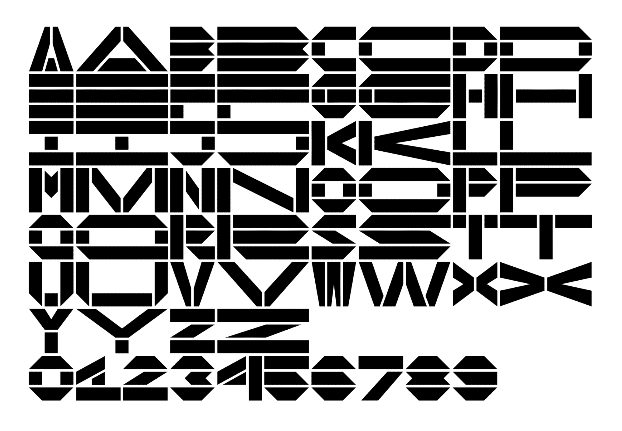
Current exploration: Modular type course (FVS)
Here is the current exploration practice that I have done so far within the modular-type course. Here you will see simple geometric shapes that formulate within a grid staying within 5x5 squares.
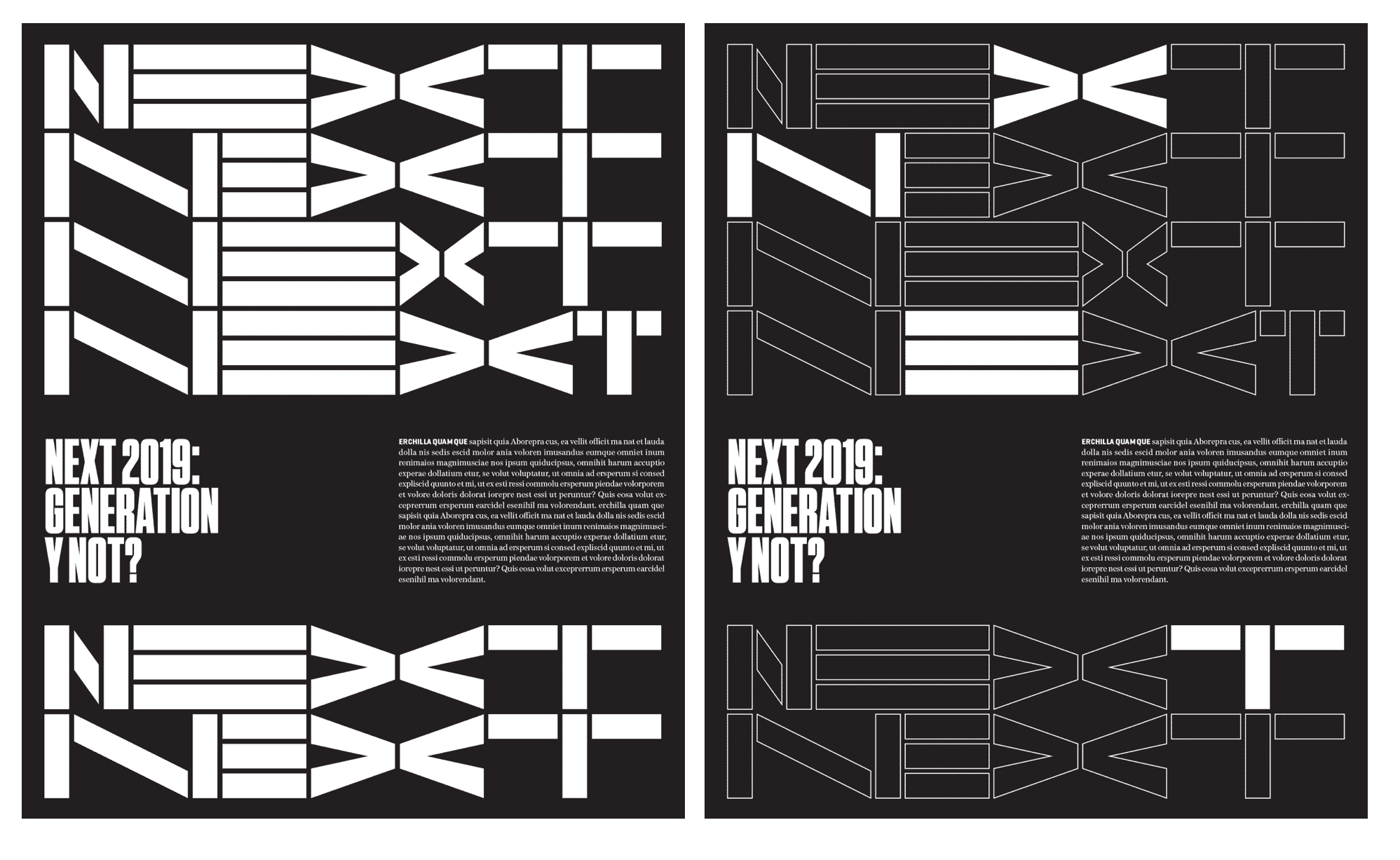
Here is my exploration for this exercise from this course.
 |
| Working practice research by Jordan Jones within the modular type course from FVS. |
"Typography is hundreds and writing even thousands of years old. This makes it a very rich field of learning, investigation, and exploration but requires as well a clear focus on YOUR field of interest." (Lorenz,2023).
From what I have learnt so far shapes inform letters when designing a font. Lorenz talks about how "you would never design single letters, but always letter systems that work for every letter, in every word, sentence, and text. The shape of the letter is always influenced by the shape of the other letters and how they work together" (Lorenz,2023).
Whilst going through this course, I came across useful information on the different types of type that are used. One image in particular that I feel is relevant to my current research studies is an image showing a specimen of printing types, by Joseph Fry and Sons, dating from 1785. It visually highlights printed type, what I found most interesting was the fact it showcases both the Latin and Hebrew language from different type design styles.
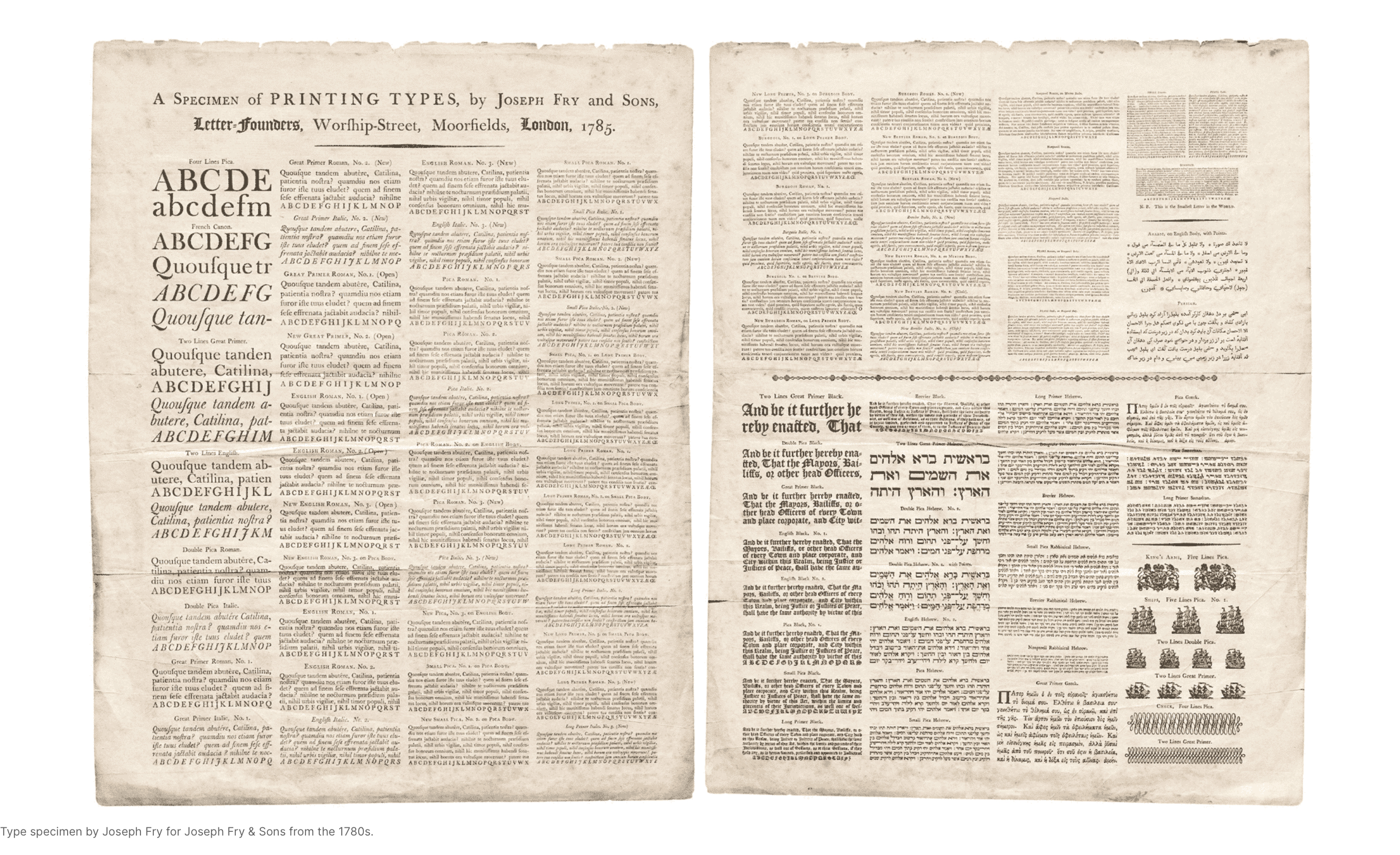 |
| Image showing screenshot taken from FVS website of Type specimen by Joseph Fry for Joseph Fry & Sons from the 1780s. |
Lorenz provides a great visual example that shows a display typeface that was used as part of a previous project designed by his design agency Twopoints.net.
 |
| Typeface designed by Twopoints.Net for ESPN |
 |
| Designed by Twopoints.Net for ESPN |
The image above visually shows how the display type visually works with the body type. The display type becomes part of the design, making it the primary focus that also gives it a visual identity through the page spread.
Below shows the exploration of using a modular approach from what I learnt from the FVS module on modular type design.


Comments
Post a Comment